Effective patient engagement case study: Infographics
Developing infographics with patient/carer involvement
“The graphics allowed me to access a world I would not usually want to enter” patient participant in HQIP’s patient engagement webinar
An important part of our work involves supporting other organisations to engage effectively with patients when delivering clinical audit and quality improvement work. This includes the organisations that run and manage the programmes and audits we commission (NCAPOP).
In March 2024, HQIP held a webinar – with guidance from members of our Service User Network (SUN) – for our NCAPOP provider organisations, to look at how to produce a ‘good infographic’. Prior to this webinar, we held a focus group with ten SUN members to hear their views on six randomly-selected NCAPOP infographics, and to learn from their feedback.
Here we share some of the slides from this webinar as a case study for those creating infographics for healthcare service users. This case study includes:
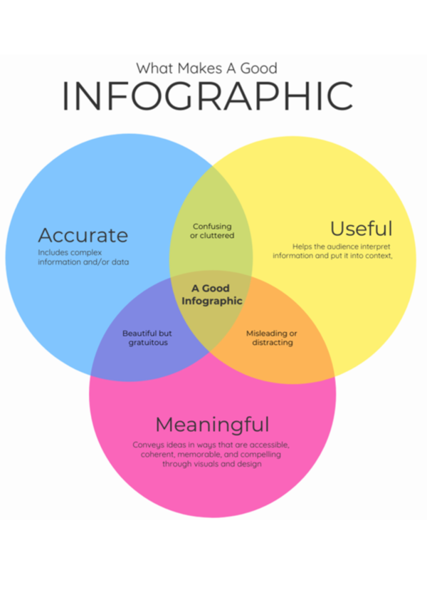
- What makes a good infographic
- Problematic infographics
- Feedback from service users (HQIP SUN members)
- A checklist to use when creating infographics.
Download the full case study using the button below.